Theme Editor
Create and customize themes in App Settings > Themes.
Create an Editable Theme
Section titled “Create an Editable Theme”Built-in presets can’t be edited in place. Start an editable theme in one of two ways from App Settings > Themes:
- New Theme: in the library action row, tap New Theme to start from the default palette.
- Customize: on any theme card, tap the Customize (paintbrush) button to copy it. The copy is named “<Theme> Custom”.
Either way, the new theme becomes active immediately and the editor opens with the name field focused.
Name It
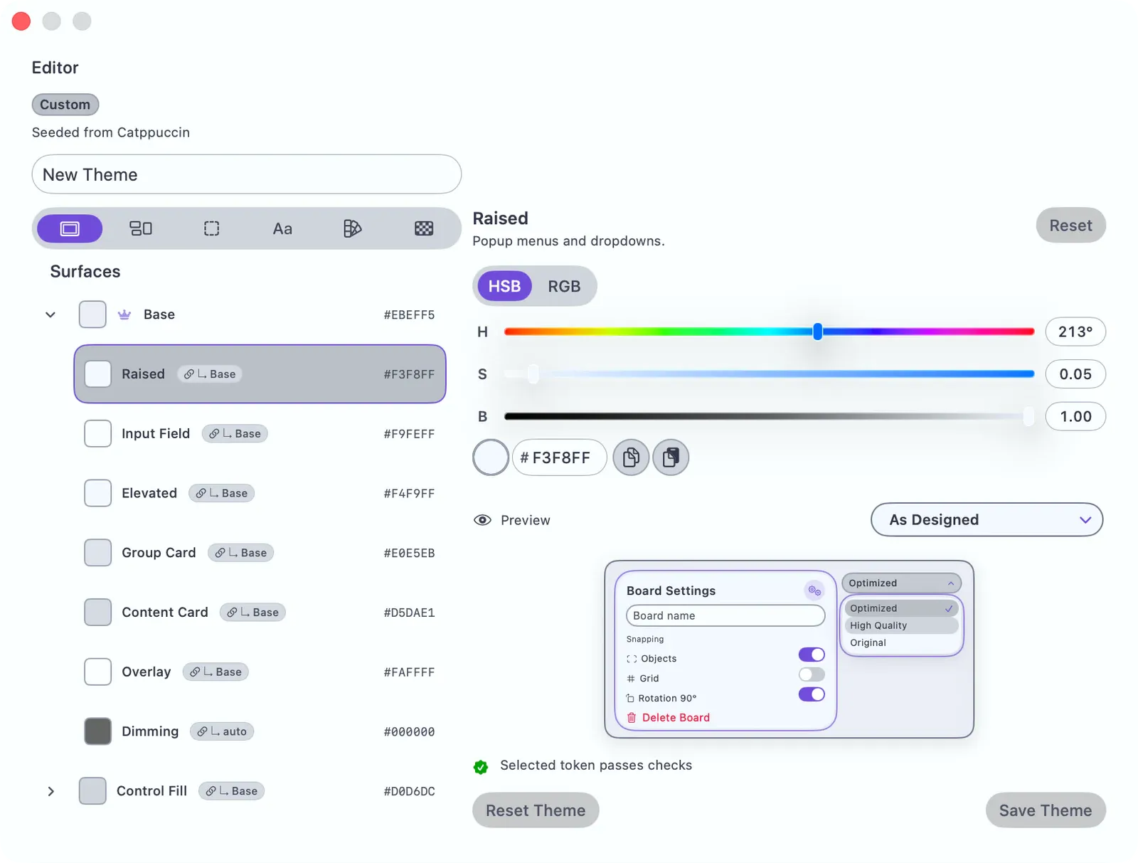
Section titled “Name It”The editor header has a Theme name field. Type a name — it’s saved when you save the theme.
Edit a Color Role
Section titled “Edit a Color Role”- Pick a category from the group bar at the top: Surfaces, Regions, Borders, Text, Accents, or Board.
- Tap a role row in the list. A row shows the color swatch, the role name, and its hex value. A crown marks a seed role (other colors derive from it); a ”↳ source” pill marks a derived role.
- The detail panel opens with a color picker. Adjust the color — the preview updates live. Roles that support gradients have a Use Gradient toggle instead.
Changes are a live preview only until you save.
Cascade Preview
Section titled “Cascade Preview”When you edit a seed role, a Cascade section lists every role that derives from it, updating in real time — so you can see the whole knock-on effect of one change. (It appears only when the edited role actually feeds other roles.)
To break a derived role away from its source and set it by hand, use Relink to toggle it back to the auto-derived value. Reset restores the selected role; Reset Theme restores them all.
Diagnostics
Section titled “Diagnostics”The editor checks the draft theme while you work. Diagnostics can flag missing roles, weak contrast, focus-ring separation, control boundaries, and color pairs that may be hard to tell apart with color vision differences or in grayscale.
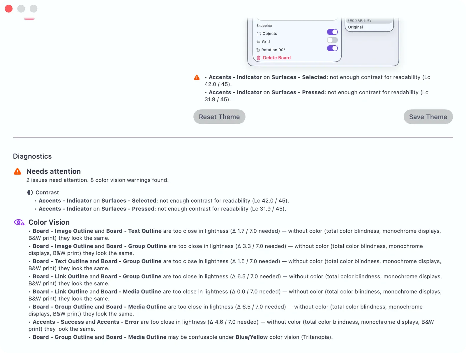
Rows with a warning icon need attention. Open the row, change the role color or the seed it derives from, then check the Diagnostics summary again. For color vision warnings, adjust lightness as well as hue so the roles stay distinct without relying on color alone.
Tap Save Theme. The button stays disabled until the theme has a name, has unsaved changes, and passes required structural validation; a confirmation toast appears when it saves. The theme is already active from when you created it — saving commits your edits to it.
Color Role Groups
Section titled “Color Role Groups”| Group | What It Controls |
|---|---|
| Surfaces | Panel backgrounds, depth ladder (raised, elevated, overlay), control fills |
| Regions | Region-specific surfaces: sidebar, gallery, header pills |
| Borders | Subtle, strong, separator, focus-ring borders + shadow styles |
| Text | Primary, secondary, tertiary, disabled, inverse, on-accent, destructive |
| Accents | Primary accent seed, active controls, indicators, success/warning/error |
| Board | Default board background, grid pattern, group fill, item outline colors |
Derivation Engine
Section titled “Derivation Engine”When you change a seed color, the derivation engine generates related colors (lighter/darker variants, complementary accents) so the theme stays consistent without tuning every role by hand. The Cascade preview shows exactly which roles it touched.
See also: Accessibility.